Tuesday, March 5, 2013

Illustrating Visual Space

Running In Space

Having collected images for the excercise as described and created the scaled versions.
My selection of images.
I set about creating some arrangements.

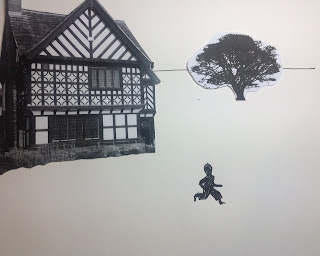
Altering the angle of the figure and placing a tree that is larger than the house above the house.This arrangement suggests the figure is running up a steep hill...

Straight forward the figure has an open path through the landscape tree and house are just backdrop.
Playing with varying sizes of the elements illustrates the changing of the 'focal length' of the composition adding in horizontal lines adds to the impression.


With the background images angled away from the figure they act as a kind of brake on the perceived speed of the running figure..
Running but seeming to stand still? Over powered and hemmed in by the opposing angles of the tree and building..


Exercise questions
i) When the figure is the smallest element it takes on more prominence, becomes the focus. There is a definite sense of vulnerability or insecurity and a greater depth of scale. There is a sense that the figure could be running around in circles.
ii) At differing angles to each other and to the frame. The placement I have chosen creates an arc over the figure that seems create focus and to hold the figure in place, reducing greatly the dynamic of movement in the figure.
iii) With all the elements all running vertical and horizontal to the frame it is is to make sense of the image, being a straight forward landscape with a figure running past a house and a tree any sense of movement or the dynamic is dictated mostly by the posture of the figure.This may increase or decrease with the size of the figure used.
This is my favourite arrangement. Where the building is smaller than the tree and behind the figure it creates a sense of distance travelled. The angle of the tree and building accentuates the dynamic of rapid movement. The large figure implies a proximity to the background and the whole effect creates tension and drama.

Sunday, February 10, 2013

Using Reference

"Sybaritic Energy"

The 50s, from a visual perspective, were a time when a trend in innovative and inventive abstract design took hold and became mainstream. Bright colour and pattern combinations in textiles and wallpapers from top designers became popular. Patterns were fundamental and sometimes rudimentary, commonly taken from the natural world. Skeletal leaves and seed pods, "fluid organic forms" crystal shapes to microbiological imprints.
Clothes became bolder and brighter became both fitted, at the bust and hips, and voluminous. Stiletto shoes and lavish hats. As with furnishing, textile designs incorporated a whole paint box of colour variations. Clothes were becoming a means of individual expression a symbol of identity; easy care fabrics and new systems of mass production made this possible for a new type of customer it appears to me to have been a very glamerous decade.
Furniture became brighter in finish and lighter in construction. Lines were cleaner with less embellishment aside from a contrast of finishes. Kitchens became more "fitted" with worktops and high-level cupboards.
Cars, Speedboats and Aircraft started to lose their blunt boxiness in favour of the sweeping aerodynamic lines of the aerofoil,a throw back from the 30s really, but one that appeared to stall in Britain during the 40s. The aerofoil shape even found its way incorporated into furniture design and other everyday objects.
Architecture too was changing, it could still be classical but also other worldly. However with the need for housing after the war the prevalent look was for the concrete high-rise block associated with "brutalism"
But there were perhaps glimpses of what might be possible in the designs of the future.

The fifties today. Good design and style never go out of fashion.
In a way it is difficult to separate a design influence from nostalgia. There are plenty of examples of companies selling 'retro' styled products, Transistor radios, telephones, costume, home accessories. Does this fulfil a faddish need in the customer or is it the natural progression of an enduring style?

Or perhaps a new younger customer who is re-discovering the style of the 50s but in a sense for the first time.
There are certainly new designers whose style could be said to have roots in the 50s, or be influenced by them. If there is a more tangible reflection of the 50s now, maybe the link is cultural perhaps the influence is a climate of innovation.


My Catalogue of reference images I created my catalogue of images from the 1950s in excel, each category is contained in a separate worksheet. I then created a PDF of the catalogue as it stands at present.
Link to My catalogue of 1950s reference material

My 50's artefacts illustration
Preliminary sketch

Having sourced an image of a seated person, that I thought would suit the composition I had in mind together with some items typical of the era. I didn't do much in the way of preliminary sketching after the sketch above. Mostly just light sketches in what would be the final piece. Rubbing out and re sketching as required resulting in the illustration below.
Illustration 1

I used water colour over the finished composition.
Am I happy with the piece? not really it doesn't have any impact and the overall effect looks rushed, which in part it probably was.
On reflection afterwards I asked myself does if fulfil the requirement of the exercise? I came to the conclusion that there wasn't enough about the content to convey a contrast with today with the fifties.
I felt it worth having another attempt. This time I would limit the content and pay more attention to detail. I will also choose something that was more obviously in the style of the 50s as a key.
I came across the Decca DM4 TV; such a typically 50s design. Intending it to appear prominently and in front of the sitter. I found a large image of it on an internet site, so traced an outline off the laptop screen using transparent 'layout paper'
Decca DM4 1956 - a rough outline

Dancette Major 1950s
I already had an image of a Dancette Major portable record player on file so also traced an out line directly off the computer screen. I have to confess the primary reason for tackling these images in this way was because my printer has run out of ink. I will add them to the composition by drawing them freehand to the required scale.
Another way I thought that I could create the feel of the fifties was to incorporate one of the iconic fifties dresses with the voluminous skirts.
On investigating this I found a Carolyn Schnurer design; I added my version of her strapless party dress direct to the composition.
Having kept faith with the image of the sitter from the previous illustration; my last but one element to include was a pair of stiletto shoes. I found a pair of original 50s shoes on a well known auction site and sketched them from the large image on the screen. This was by way of both practice and reference for when I added them to the piece to the scale required.
My last two nods to the era were to be the chequered floor pattern and a Mark Rothko art work.
To achieve an accurate chequered pattern I found some information on creating the pattern.
Putting it all together I couldn't make my mind up as to what medium to use. I opted for colour pencils and although not convinced by the effect, I am pleased with the composition.
The finished illustration
Other items that I thought about including were; an Upright vacuum cleaner first appeared in the 50s but still familiar now and a washing machine in the interest of not becoming too cluttered I discounted this.

Sunday, February 3, 2013

Mark Making

Pencils..Pencils..Pencils, for me, pencils have always been a means to an end, solely a way of creating an outline to be hidden in the end piece, a guide for another medium.
Concentrating, as I have in the past on pen and ink and then painting in acrylics, I have had a tendency to stick to what I know. In this respect it has been very easy to become accustomed to only viewing and handling pencils in this temporary, transitional way. Thus ignoring the potential of this medium.
I find that to be asked to experiment is both alien and challenging.

Pencils at the ready...
My initial foray is to take a piece of heavy handmade water colour paper made at the Moulin de Pombie, France.
Using 3B, 6B, 2H pencils and charcoal to make samples of variations of cross hatch and stippled shapes.
My observations; the 'weave' of the paper has a definite direction which makes the line quality of the opposing angles of the cross hatch strokes appear different. The roughness of this particular paper and therefore the friction of the medium against the surface 'draws out' more medium with less pressure. This makes it particularly tricky to handle the charcoal as there is a lot of surplus 'dust' which makes the image more prone to fill in.
With the harder 2H pencil the reverse seems to be the case, it was difficult to make a viable impression particularly with a pointed pencil the surface was scratched by it. More pressure was needed to make a mark.

Moving On..For my next sampler I use a wider range of pencils from soft to hard, each used in the same way to show a direct comparison between the grades. The paper is 100gms Soft sketchbook
An example of stippling with a technical pen is the centre piece.

You old smoothy The next marks are to experiment with changing the media. I first chose a smooth white card, I believe it is inkjet photocard.

If anything this shows that pencils are best suited to this smooth surface. The surface has less direct physical influence on the line drawn; therefore it gives more scope to the artist for showing technique and tonal effects.
An observation that I made during this part of the exercise.
When cross hatching the tendency is to alter the way the pencil is held in the hand, to make the change in direction, this can by default lead to an unintentional change in the quality of the drawn line.
Whereas by turning the piece and using the same hold on the pencil uniformity is maintained. Of course the variation described may be what is required for effect, by the artist. I find that even with charcoal there is more control, potentially more scope to experiment with this medium.

Just to diversify, I decided to look around for something else to add to the mark making experimentation.

These marks are made using a japanese bamboo pen and an FC PITT Art Pen (B) on 240gm2 textured watercolour paper. I found that the bamboo pen was quite versatile with the potential for some pleasing effects but was labour intensive as the ink was transferred quite quickly. The Art pen, being quite free flowing, was difficult to stipple with on a small scale. This brief experiment introduced the element of absorption of the paper as an extra consideration.

My last group was achieved using a smooth copier type paper and I found that using the pencils on this surface reinforces what I found with the card the end product isn't as heavily influenced as it is with textured papers.


And Finally three examples one each of Stippling, Dry brush and Cross hatch.

Introducing Lepus arcticus - The Arctic Hare
...and in dry brush..
Neglected from earlier experimentation. I wasn't sure of the technique.
An Ugg-ly boot showing some cross hatch tones.

Tuesday, January 15, 2013

Exploring drawing and painting

Go Ugg crazy or This could get Uggly
An excise in art mash up. Mixing medium and media.
My first experiment combines biro line drawing and cross hatching with fine liner pen, water colour (wet and dry brush) and pastels on a watercolour paper.

The next image is on thick tissue which was screwed up then flattened out. I used a fine felt pen some water colour and pastel.

I chose to use only pastels on my next attempt but using them in different ways. Lines, blending, smudging and cross hatch on a matt card.

Starting to feel a bit less adventurous than I thought still enjoying the unrestrained feeling.. For my next trick taking a piece of gloss photo paper and drawing in water colour and pen with a bit of pastel.
Interesting feature to note, the water colour has kind of etched into the gloss surface so the gloss areas left give the boots a contoured 2nd dimension feel. Unfortunately not that obvious in this representation.

Really going for it now Charcoal on the shiny brown paper pre screwed and flattened out.
What does this tell us? Don't use charcoal on shiny brown paper, perhaps.

Considering some of the suggestions in the exercise directions I am being a bit conservative.
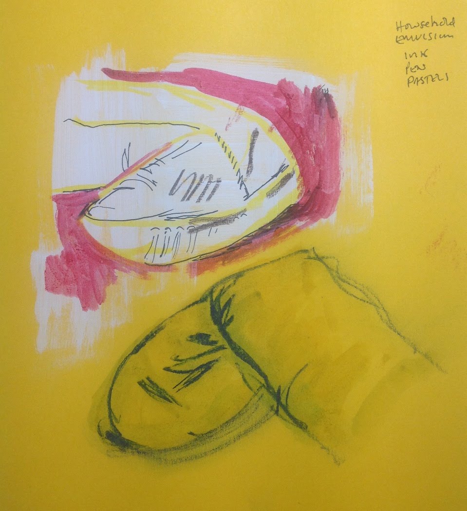
What about bright yellow card, household emulsion paint then drawn and painted over with liquid acrylic and pen and the boot on the other foot. Pastel line washed over with water colour.

What the...?

My final exploration a rough pastel base on cream card image drawn in charcoal partly blended.

Friday, December 14, 2012

Assignment 2 - Point of sale display

Initial thoughts
Identify typical seasonal produce of Summer and Autumn. What are the colours and textures associated with both seasons. What other markers of the two seasons are used.
We are in the beginning of Autumn now, based on the principle that global sourcing has all but done away with the notion of seasonality the truly seasonal products are, by my own observation, most likely to be those grown in this country; and or locally. Observe and note how the local supermarkets market their produce. A good source for ideas are the 'box schemes' for logistical reasons they tend to have local origins and so more likely to be seasonal.

Summer fresh fruit and vegetables
  • Strawberries
  • Raspberries
  • Peas
  • Beans
  • New potatoes
  • Tomatoes
Autumn
  • English apples
  • Pears
  • Squash
Selection
When selecting the fruit and or vegetable used in a campaign does some consideration need to be given to its familiarity with the target market? Are marketing considerations of concern to the illustrator? Starting with Autumn; for the subject of my objective image my initial thought was to use apples. The following sketches were made to stimulate ideas of form and setting,
with a bit of all important practice thrown in.
I like to keep my options open and whilst out shopping I saw and bought a couple of Kabocha and smaller munchkin squashes. I took a few photographs of different combinations, groupings and lighting. Also I did a couple of preliminary outline sketches example:-
I decided I was needlessly complicating what was required. Although the thought and decision making process was beneficial.
I attempted a water colour, of a single Kabocha squash, but I was not happy with the result, added to which I had used the wrong sort of paper, which when scanned showed up the effect the water had on it. Considering a new rendition of the squash. I came across an article about cooking apples with a nice close up photo of a box of them. I grabbed a box of pastels and had a go at a section of the picture.
I have not worked with pastels to any extent so am quite happy with the results. But I still intended to have another go at the squash in watercolour. I then realised that I had given no thought to the summer season and to what fruit or vegetable to select. Strawberries and raspberries seemed to be the obvious choice but some further consideration seems warranted. I am also considering some potential design ideas for the final pieces at this point. I am keen to use some kind of pattern involving leaves or leaf shapes for the background of the autumn piece. I think stylised but based on an actual type of leaf. There are plenty of examples to hand, all over the garden in fact. In the mean time working on the squash, taking a bit more care and concentration.
In search of a summer fruit or vegetable to be objective about. In some respects the seasonal aspect of summer is worse than that for autumn, most of the iconic summer fare can be bought all year round. One of the vegetables still primarily seasonal is the humble fresh pea. In the mean time I tried a few samplers.
My pea effort didn't have the impact I had hoped for
Casting about for alternatives; I found myself warming to the idea of Tomatoes. OK granted they are the one thing that you can see lots of all year round, but they always look and taste better in the summer. The shiny bright orangey red skin is still evocative of summer sun and warmth.

This is my objective study of tomatoes. Well it started out as objective but I am not sure if, in the manner I have chosen to add the colour, that it hasn't become slightly subjective.. I am putting this down to a lack of skill in handling pastels.
Getting back to the design of my Autumn POS display.
My idea for a background pattern is taking shape.
As mentioned previously, I am basing it on a simple repeated fallen leaf pattern.
Here are some early ideas. I quite liked the oak leaf shaped pattern and had an idea that a thick woodcut type effect might suit. But after some consideration decided that as a repeated pattern it would be difficult to make the simple cohesive pattern that I was after. I therefore concentrated on a more simple pattern.
Already thinking about how to handle the image, I thought complimentary autumn colours, browns, burnt colours etc. Light background with slightly darker leaf outline. The precise colours will come from a bit of trial and error in Photoshop. To add a bit of variation and to reflect the nature of falling leaves, I will alternate the image by turning it 180 degrees. So the repeated image is now a pair of leaves pointing in opposite directions.
I plan to layout the final design in quark express as I am familiar with the software.
Initially I tried to create the complete background by repeating the image in image boxes in quark, but having laid it out and carried out some test prints, the prints showed gaps in the background which were not visible in the quark layout screen. Trying to correct this turned in to a game of 'guess where the gap appears next'.
I decided that it would be quicker to create one image the size of the piece in photoshop. It took a bit of time to place and repeat to achieve it.
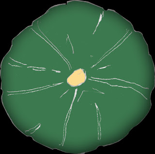
Next came the decision on incorporating the main element; the squash. Since studying them for the objective piece, I was taken by the view when looking straight down on them from above with the core in the centre. I decided that I would go for that idea.
I drew this line drawing and created an image file to 'fill in' in photoshop. I intended to add colour in the software. And perhaps play around with some simple effects to enhance the design.
I filled the image with colour and added an inner shadow for some depth to the shape. I cut out the image to separate it from its background so that the image I inserted in quark had a transparent background.
For the layout I will repeat the image but make the second smaller. A single squash looked a bit lost and adding another one slightly smaller adds depth to the design. Finishing off the piece with some text.


An early idea for a summer design.
Well as a potential background anyway, perhaps with the tomato group overlaid. I intended to redraw the group from my objective piece and to that end was idly playing with water colour when one of the test pieces gave me an idea.
A repeated pattern for the background similar to the leaf pattern from the autumn POS. However I can guess that this might impact on the plan to use a version of the tomato group in the foreground.
A couple of alternative ideas.

I started to look around for an alternative in a contrasting colour I think I may go for asparagus.
In the meantime having finished the background image
For text on the design I think that I will replace some blocks of the background with the text. I have already tried a few variations in Quark. Moving on...A new objective piece this time some asparagus.

I will use this actual image over the background I have created. This may be in the form of a picture post card giving a summer holiday feel. I am laying out the finished design in Quarkexpress passport from the elements already outlined here. The finished designs for both Autumn and summer POS displays will be pdfs and the links to the finished pieces are here.
POS display autumn
POS display summer