Friday, December 14, 2012

Assignment 2 - Point of sale display

Initial thoughts
Identify typical seasonal produce of Summer and Autumn. What are the colours and textures associated with both seasons. What other markers of the two seasons are used.
We are in the beginning of Autumn now, based on the principle that global sourcing has all but done away with the notion of seasonality the truly seasonal products are, by my own observation, most likely to be those grown in this country; and or locally. Observe and note how the local supermarkets market their produce. A good source for ideas are the 'box schemes' for logistical reasons they tend to have local origins and so more likely to be seasonal.

Summer fresh fruit and vegetables
  • Strawberries
  • Raspberries
  • Peas
  • Beans
  • New potatoes
  • Tomatoes
Autumn
  • English apples
  • Pears
  • Squash
Selection
When selecting the fruit and or vegetable used in a campaign does some consideration need to be given to its familiarity with the target market? Are marketing considerations of concern to the illustrator? Starting with Autumn; for the subject of my objective image my initial thought was to use apples. The following sketches were made to stimulate ideas of form and setting,
with a bit of all important practice thrown in.
I like to keep my options open and whilst out shopping I saw and bought a couple of Kabocha and smaller munchkin squashes. I took a few photographs of different combinations, groupings and lighting. Also I did a couple of preliminary outline sketches example:-
I decided I was needlessly complicating what was required. Although the thought and decision making process was beneficial.
I attempted a water colour, of a single Kabocha squash, but I was not happy with the result, added to which I had used the wrong sort of paper, which when scanned showed up the effect the water had on it. Considering a new rendition of the squash. I came across an article about cooking apples with a nice close up photo of a box of them. I grabbed a box of pastels and had a go at a section of the picture.
I have not worked with pastels to any extent so am quite happy with the results. But I still intended to have another go at the squash in watercolour. I then realised that I had given no thought to the summer season and to what fruit or vegetable to select. Strawberries and raspberries seemed to be the obvious choice but some further consideration seems warranted. I am also considering some potential design ideas for the final pieces at this point. I am keen to use some kind of pattern involving leaves or leaf shapes for the background of the autumn piece. I think stylised but based on an actual type of leaf. There are plenty of examples to hand, all over the garden in fact. In the mean time working on the squash, taking a bit more care and concentration.
In search of a summer fruit or vegetable to be objective about. In some respects the seasonal aspect of summer is worse than that for autumn, most of the iconic summer fare can be bought all year round. One of the vegetables still primarily seasonal is the humble fresh pea. In the mean time I tried a few samplers.
My pea effort didn't have the impact I had hoped for
Casting about for alternatives; I found myself warming to the idea of Tomatoes. OK granted they are the one thing that you can see lots of all year round, but they always look and taste better in the summer. The shiny bright orangey red skin is still evocative of summer sun and warmth.

This is my objective study of tomatoes. Well it started out as objective but I am not sure if, in the manner I have chosen to add the colour, that it hasn't become slightly subjective.. I am putting this down to a lack of skill in handling pastels.
Getting back to the design of my Autumn POS display.
My idea for a background pattern is taking shape.
As mentioned previously, I am basing it on a simple repeated fallen leaf pattern.
Here are some early ideas. I quite liked the oak leaf shaped pattern and had an idea that a thick woodcut type effect might suit. But after some consideration decided that as a repeated pattern it would be difficult to make the simple cohesive pattern that I was after. I therefore concentrated on a more simple pattern.
Already thinking about how to handle the image, I thought complimentary autumn colours, browns, burnt colours etc. Light background with slightly darker leaf outline. The precise colours will come from a bit of trial and error in Photoshop. To add a bit of variation and to reflect the nature of falling leaves, I will alternate the image by turning it 180 degrees. So the repeated image is now a pair of leaves pointing in opposite directions.
I plan to layout the final design in quark express as I am familiar with the software.
Initially I tried to create the complete background by repeating the image in image boxes in quark, but having laid it out and carried out some test prints, the prints showed gaps in the background which were not visible in the quark layout screen. Trying to correct this turned in to a game of 'guess where the gap appears next'.
I decided that it would be quicker to create one image the size of the piece in photoshop. It took a bit of time to place and repeat to achieve it.
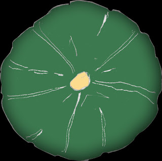
Next came the decision on incorporating the main element; the squash. Since studying them for the objective piece, I was taken by the view when looking straight down on them from above with the core in the centre. I decided that I would go for that idea.
I drew this line drawing and created an image file to 'fill in' in photoshop. I intended to add colour in the software. And perhaps play around with some simple effects to enhance the design.
I filled the image with colour and added an inner shadow for some depth to the shape. I cut out the image to separate it from its background so that the image I inserted in quark had a transparent background.
For the layout I will repeat the image but make the second smaller. A single squash looked a bit lost and adding another one slightly smaller adds depth to the design. Finishing off the piece with some text.


An early idea for a summer design.
Well as a potential background anyway, perhaps with the tomato group overlaid. I intended to redraw the group from my objective piece and to that end was idly playing with water colour when one of the test pieces gave me an idea.
A repeated pattern for the background similar to the leaf pattern from the autumn POS. However I can guess that this might impact on the plan to use a version of the tomato group in the foreground.
A couple of alternative ideas.

I started to look around for an alternative in a contrasting colour I think I may go for asparagus.
In the meantime having finished the background image
For text on the design I think that I will replace some blocks of the background with the text. I have already tried a few variations in Quark. Moving on...A new objective piece this time some asparagus.

I will use this actual image over the background I have created. This may be in the form of a picture post card giving a summer holiday feel. I am laying out the finished design in Quarkexpress passport from the elements already outlined here. The finished designs for both Autumn and summer POS displays will be pdfs and the links to the finished pieces are here.
POS display autumn
POS display summer

Saturday, November 10, 2012

Visual Metaphor

Some examples of Visual Metaphor:

And my favourite


Having chosen Economic Catastrophe as my phrase here are some ideas...

The economy catastrophically explodes...

then there are natural disasters used as a metaphor for instance tsunami or earthquake...


And a selection of variations on a theme..

Falling charts, dealing desk anxiety, melting currency symbols, crumbling ancient buildings / factories.

Saturday, October 13, 2012

Choosing Content - Daffodil Affair

What's it all about?
Reflecting on the excerpt from The Daffodil Affair. A detective, in New Scotland Yard during the second world war; sits at his desk and contemplates the case that he has worked on for the past 15 years.
The described cycles of sun and shadow, illustrate a passing of time and yet also a sense of standing still. By implication a sense of frustration leads to an explicit restrained anger on the part of the character. To me there is a claustrophobic feel in the description of the room, a featureless dehumanised zone, cell like; combined with the continual transition of light and shade in some sense this reflects the claustrophobic nature of a case with no opening.
The character moves from his desk to the window which paradoxically both reinforces that, like the view, little on the case has changed and that the source of light is also the source of new possibilities. I see the character as being middle aged. His face has the lines associated with carrying  emotional burden but are more pronounced than is usual for someone of his age.
Considering that the character in the piece is a detective in the 1940s I almost immediately thought of the TV detective Christopher Foyle played by Michael Kitchen in the television series Foyle's War, set during the second world war. This may be a good source for examples of 1940s material and scene settings.
The character would be dressed in a dark grey wool suit probably 3 piece however in the office he would have removed his jacket to reveal a white cotton shirt; collar and conservatively patterned tie. As described in the text, the room is sparsely furnished with just the articles necessary for the job. I see a large desk with drawers on either side, a large blotter; telephone and card index box; plus wooden static chair. On the floor is a round metal waste paper bin. There may be a metal four drawer filing cabinet.

I remember visiting the MOD offices in Newcastle in the late seventies and it was furnished In just such a way and probably hadn't changed significantly since the forties. There were few creature comforts minimal personalisation a single photograph of a loved one on a large leather topped desk. Again I could use this experience as a reference point.
 
This is my collection of images based on the vision I have for the setting; including pictures of the outside of the then New Scotland Yard building; to gauge the style and size of the windows and for a bit of extra context to get an idea of what the character sees when he looks out of the window. A list of words suggested by the thought processes so far: monochrome, depressed, bland, repressed, conservative, sombre, austere, oxidised, shadowy, conservative, repressed, restrained, suppressed, dark, subdued, stark. From which I decided to focus on the word restrained The dictionary definition is
  1. To hold back or keep in check; control: couldn't restrain the tears.
  2. To hold (a person) back; prevent: restrained them from going.
  3. To deprive of freedom or liberty.
  4. To limit or restrict.
  5. Characterized by reserve or moderation; unemotional or dispassionate.
  6. (of color, clothes, decoration, etc.) Understated and subtle; not excessively showy or ornate.
http://www.thefreedictionary.com/restrained

I feel this word not only captures, in general, my perception of the setting of the piece but the demeanour of the character as well as connecting to the ultimate aim of the character the apprehension and restraint of a suspect.

Moodboard
I used images that both illustrated 'Restrained' as meaning reserved in colour, content and texture as well as the alternative definition of contained emotion.
I ended up with quite a bleak austere mood. Perhaps overly so. Although it did lead me to examine more closely the part the light and shadow plays in the text which I believe is quite important.

Considering the actual portrait my next task was to find examples of the expression on the face of the of the character. Using google image search, I found 4 images that had potential.


A fifth image, a woodcut print of a scene from the 
film The Big Sleep gave me an idea not in terms of facial expression but for a possible setting of the portrait.
I also liked the effect of the method used to create the various tones, particularly the light and shadow from the window where it meets the character.
With some adaptation I felt I could incorporate effects from some other images I had already collected. I already had an image of a window with sun shining through it where the shadow of the criss cross of the frame created the effect of bars. A visual metaphor for restrained? I did a couple of sketches of how I saw the picture.

Firstly, to rough an impression of how I thought the images I had in mind might relate to each other, then a more accurate rendition of how the finished portrait might look. Changing the look of the window and incorporating the character and swapping his hand gun for a folder representing an open case file.
My initial feeling about what media to use for the final piece was to recreate the effect of the wood cut picture probably in pen and ink; as I felt that it had impact but also fed into the 'restrained' idea. But on reflecting further as I hadn't considered an image montage in the past I decided to see if I could achieve a convincing version of my sketches using parts of the pictures I had to hand.
The key elements to go into the final portrait I had already decided upon. It had to include the window with the shadows that looked like bars, an altered version of the character from the wood cut image. I cut and shaped a folder containing sheets of paper.
To add to the cell like claustrophobic feeling I used an image of painted brickwork as a back drop which I split into sections to add movement. The expression of the character I used was not quite right so I attempted to alter this by adding a few creases in his forehead. I think the finished piece it is quite effective and I am relatively pleased with the results. I am happy that I resisted the tempation to just draw a picutre of Christopher Foyle.

Monday, July 30, 2012

Black & White

Whilst considering which subject to choose for this Black and White exercise. I took a fine black ink pen, pencil and sketch pad to the beach and sketched some views up and down the beach and out towards a neighbouring island. This view was quite striking because the sea seemed to be divided, waves appeared to be forming near the shore whereas further out and towards the island the sea seemed much calmer. This still area reflected the bright grey of the sky, whilst the waves were dark the foaming wave caps were very bright white.
This last sketch caused problems when trying to convey the tone variations; and the whiteness of the waves against the varying grey shades of the sea reflected in the overcast sky. I sketched the same view in pencil as well to see if it was easier to capture the subtle contrasts.
But in thinking about the scene afterwards I thought it would lend itself to this excercise very well. Because of its simplicity and having already considered controlling tone in both pen and pencil I chose to draw the outline shapes as a separate piece.
Which I then enlarged to suit A3 and inverted. Sticking with the principle that the whiteness of the waves was key to the piece I cut the black areas accordingly.
My only area of uncertainty was how to represent the island and the immediate area around it. Do I go for a black sky and white island with a corresponding black area behind the waves? This would have the advantage of defining the tops of the furthest waves. I settled for the island as a black silouette.
Having fixed down all the black areas and completed the piece my observations on the effect are that in a way this method captures the bright whiteness of the waves in contrast to the surrounding grey that I saw on the day I made the sketches.
However It also illustrates its limitations, some areas of tone cannot convincingly be converted to black or white and still maintain a sense of depth or a sense of a change in the environment.Although perspective can be captured. The effect however can be very stark and dramatic. And puts me in mind, as I have become familiar with his work, of Edward Bawdens prints.

Tuesday, July 10, 2012

Objective - Subjective

My Objective drawings
Examples of Objective observations of a pair of glasses.
Drawn without any implied characteristics.


My Subjective drawing.
My object of choice is a baseball type cap. This particular cap is mostly cloth the only rigid part is the peak. The list of words that I made whilst contemplating the cap included the following.
  • Crumpled
  • Creased
  • Squashed
  • Formless
  • Shapeless
  • Cotton
  • Faded
  • Casual
  • Wrinkled
  • Misshapen
  • Headgear
  • Malleable
  • Convenient
  • Comfortable
  • Soft
  • Round
  • Shabby

The word I chose to associate with the object was Casual
To help in creating a moodboard; I first checked the dictionary definition of the word to confirm my understanding of what it meant. The definitions according to Collins English are: Happening by accident or chance; being or seeming unconcerned or apathetic; not premeditated; shallow or superficial; informal article of clothing or footware; occasional;.
Added to which I considered; unintended, not contrived and not by design.
My focus for items to include in the moodboard became casual clothes; creased and crumpled fabrics;.
I included some obviously contrived examples of casual dress as a reference point and contrast. Having cut out the images using a knife; I then decided to just tear roughly round the images indicative of a casual manner.
I believe that creating the moodboard helped me to understand what was totally contrived as opposed to that which didn't appear to be so. It made me think in terms of how I could make my piece casual. I played around with the idea of recreating the texture of the hat, its shadows and high lights, by cutting out dark and light sections from images of crumpled fabric. However I decided to create the image on a piece of paper which I screwed up first as tightly as I could which I then flattened out again.
This gives the image a texture that is intended to mimic the appearance of the fabric. I then intentionally with little care brushed the greenwash over the hat. I found that it then needed some depth and at that point added some grey.
By the way; part the way through the process I dumped the baseball cap in favour of this hat. Although it had more substance than the cap, I considered that it still displayed the same basic attributes as the cap.
I also decided to tear round the hat to leave a random shape surrounding the hat. And then fix it to another sheet of paper to finish. I toyed with the idea of tearing in the shape of the hat but favoured the more casual version.

Wednesday, May 23, 2012

Words to Pictures - Moodboard

To stimulate the thought process when considering a topic for illustration it is key to explore as many possiblities as is practicle. An aid to starting this process is the Spider diagram. Taking the subject name i.e. 'fashion' as the centre point write down words that come to mind then do the same again from those words untill you end up with something like...
To move on from this you then think about the words that you have compiled, whilst considering new and alternative words, and 'convert' them into images.


My initial attempt was very much just, think of a word or pick a word on the spider chart and sketch an image quickly without considering detail or technique

I then decided to tear some thick water colour paper in to squares and create one or two images on each. This time in more detail. I used pencil, ink, ink pen and water colour. Here are some examples..


Having worked through these processes I can use a combination of the thoughts stimulated by the words from the spider diagram and the pictorial versions to put together a moodboard. Essentially a further visual reference point, a representation of ideas on illustrating the topic. Although the aim of the Moodboard is not to produce a finished piece of art; I found it difficult to resist the temptation to create a design whilst deciding how to use the images I had found. Perhaps I didn't resist at all, scalpel art!

Sunday, April 29, 2012

Exercise 2 - Editorial interpretation

Taken from the January issue of Hi Fi news, the editor asks the question; how relevant will the content of the current issue of the magazine be in 50 years time. In answer to his own question he points out that the Vinyl LP is now over 50 years old and is enjoying something of a resurgence in popularity.
Attention is also focused on the CD. Launched 30 years ago the magazine will be helping celebrate its pearl anniversary.
His second point is regarding hearing. It’s a vital part in the music reproduction chain; but how many people take as much care with their hearing as they do with their sound reproduction equipment. Is it the elephant in the hi fi listening room?.
My interpretation is that ‘good’ technology, particularly in music reproduction, lasts longer than expectations and that new emerging technologies don't necessarily dictate the fate of the older technology.
Ideas to interpret this editorial through illustration included incorporating symbols and or images of the past, present and future sound playback technologies living side by side. I researched symbols used in laser technology and from hifi equipment manuals and circuit diagrams.

Initial rough

I felt that key to the design would be a suitably futuristic 'listener' and in browsing
the internet for a likely subject, I happened upon manniquin heads used for displaying wigs. One in particular caught my eye; it had all the attributes I was looking for, a futuristic visage, slightly android, androgynous appearance. Unusually small ears which had the potential to show the evolution of the ear that may happen when all sound is compressed e.g. mp3 etc
The next step was to sketch ideas as they came to me combined with some of the symbols I had already found.. ending up with an ideas mash up! emphasising some of the key words and thoughts from the editorial.

I then went through a kind of selective thought process, mentally rating the sketch ideas and discounting the elements that I thought weak or not easily identifiable. After this process I had in mind to keep to three main images. I liked the idea of the use of the head to create 'the listener' and an image of a CD as my 'old technology'. But I needed some way of illustrating that the listener was involved in the process of listening to digital compressed sound, the sound of the present possibly future technology, possibly using binary code...I sketched some ideas.

Sticking with the concept of binary code entering one ear and leaving the other I made the first draft of the layout.

Happy with the design so far. I was unsure of what media to use. I felt the right finish would heighten the impact of the simple design. Although unfamiliar with the use of pastels I experimented a bit. I will admit that experimentation was limited and I had at one point settled for this version.

I really had in mind that the binary code would be quite subtle but could see that it would, potentially, take a lot of experimentation to achive the desired effect. And at that point I left the exercise to carry on with the first assignment.
Endeavouring to get this record on the blog I re-appraised the design and looked at constructing the design in Photoshop. I have some experience with the software but am unfamiliar with a lot of the tools. I did a bit of experimentaion.

I am quite pleased with the attempt. It obviously requires more work. I would like to 'paint in' the body and possibly reintroduce the binary code effect but this would require further practical instruction in Photoshop.