Sunday, January 19, 2014

Exercise: Travel guides

Exploration
Rather like the audience the travel guide is aimed at, I guess to start this exercise I need to explore and familiarise myself with the three cities that are the subject of it. I recently saw an episode of a series about the aspects of the history of Istanbul 'Byzantium - A Tale of Three Cities'. So I have a few pointers to work with, but know nothing about Helsinki and Milan
I suppose one of the questions to ask is; what type of person or persons will the travel guide be aimed at? general sightseeing, essentially historical, cultural, architectural or a combination of all
I feel its important that the design should make the location appear interesting on different levels, and therefore encourage the customer to want to look inside the book even if it means including something unfamiliar or at least not recognisable, hopefully something aesthetically pleasing to whet the appetite.
My rough brief; taking the size 240mm x 160mm (Helligan handbook)landscape.
Capture a wide variation of aspects of the city; historical, cultural, geological; archetectural, showing where possible the place as modern and vibrant, forward looking as well as in its historical context
I created three mood, come reference panels based on research on the web


I also included font references to assist with that aspect. As I was creating the boards I was already having ideas about Istanbul the domes and minarets are so striking, that as a silhouette I think they are visually engaging, albeit a bit cliche
Some ideas.. I quite like the idea of a contrast between the ancient and modern skylines, perhaps superimposed?..

Or Historical and modern juxtaposed naturally in the same scene
I did some research on likely fonts

This one was found under the header Byzantium..
I liked this style but thought I could improve on it by turning the verticals into minarets like..
I continued piecing together the client visual for the Istanbul version whilst formulating ideas for Helsinki
In the Basiclica Cistern http://en.wikipedia.org/wiki/Basilica_Cistern there is a bronze pillar, on the pillar is a repeated pattern reminiscent of the 'eye' on a peacocks tail.
It is just the sort of off the wall image that I am looking for
some attempts at replicating them...
So the client visual is looking like this...
The sultan Ahmed (Blue) Mosque and the Ortaköy osque incorporating the Bosphorus suspension Bridge laid over the top. In the Ipad app Procreate I then drew outlines of the other elements. Adding the Whirling Dervish (Sufi) Skirts. I then saved as a jpeg to import to Adobe Indesign on a layout of the correct dimensions.
I will be taking Istanbul to mockup stage.
My work on Helsinki progresses
There is a statue called the Havis Amanda http://en.wikipedia.org/wiki/Havis_Amanda I have decided to build the design around it.
The font is a hand rendition of Nordic Font  quite apt. My original selection has licensing implications so I have dropped that particular one.
I have to include the stunning Sibelius Monument. A mass of engraved stainless steel tubes brought together in a fantastic sculpture.
This is my sketch view and read about the monument here: http://www.eilahiltunen.net/monument.html
I have also a sketch from an original architect impression of the Kiasma Art Gallery
And sketch of Helsinki Cathedral
Client visual, with the addition of City badge and captions indicating what the places are.

Up to this point Milan is on the back burner, I want to keep it simple I have seen a couple of images that I think could work well together. There are statues on top of the spires of the Duomo di Milano they are in effect overlooking the city. I also found a graphic of all the tall buildings in a line,I could take a section and create a skyline effect with the statues overlooking.
I discovered that the boroughs of the city make a good graphical pattern, like the petals of a flower
My hand copied font
The Milan client visual
The Istanbul mockup; I cut out the silhouettes of the two mosques and in Photoshop and applied colour. With the palette I tried to reflect the warm colours of the climate and the bright blue of the sea. Initially I was only going to use only the skirts of the dancers but went for a combination of the two I thought about adding captions but decided to make a design out of the place descriptions.
My completed mock up
Having completed the exercise, on reflection there are some observations; The background colour is lighter on screen and gives the idea better balance overall. The design is not what you would call diagramatical. The reproduction of the font for Istanbul has turned out quite indistinct. The design doesn't fulfil the remit of showing a balance between historical and modern city life. of course all of these issues can be addressed going forward.

Wednesday, January 1, 2014

Excercise - Editorial Illustration

In Jessica Rae Gordon's Illustration for a Midwives Magazine (Canada)editorial

http://jessicaraegordon.blogspot.co.uk/2011/03/midwives-editorial-illustration.html

you don't need to read further than the synopsis of the piece to 'get' the illustration; the window indicates that it is night,and the foetal image makes it specific to the article, the male figure possibly in pyjamas (staying the night) placed in a chair indicating the temporary nature of the setting. The illustration is neutral in this respect that makes no comment about the content of the piece and is a visual rendition of the synopsis.

In Phil Disleys illustration For The FT site 'how to spend it', The Eco-Lodge; a short story about honeymooning in an eco lodge

http://howtospendit.ft.com/adventure/38593-the-eco-lodge

Phil litters the piece with visual references to items described in the story.
The faces of the characters their movement and the opposite direction they are travelling in highlights there are apparent differences in each persons experience. Even the vibrancy of the mans shorts seems to suggest he is out of place. Whilst the woman dressed in muted jungle tones and surrounded by jungle animals has embraced the environment.

Paris still the best place on earth

The following text is taken from from http://www.ucityguides.com/paris/

The French mastered the art of living, and their capital showcases it with the utmost sophistication. While the Louvre may be the world's unparalleled museum and the Eiffel Tower one of the most recognized landmarks, what has made Paris the world's most visited city is precisely that French art de vivre.

The real draw is the city itself, its elegant boulevards, charming cafes and markets, glamorous boutiques, fine dining, the Seine, romantic visions, and of course, the art.

Paris is pure hedonism, which is why becoming a flâneur is as important during a visit to the city as seeing any particular sight.

Sit at a café or bistro for a café crème and croissant, window-shop, grab a baguette at a market, have an aperitif before dinner, and indulge in haute cuisine.

Paris is in many ways the perfect city, so who can blame it for seeming self-absorbed, self-important, perhaps even narcissistic? While many outside visitors often diagnose its confidence as a superiority complex, Paris in reality is a very open and welcoming city. Its multicultural population has given it a revived creative energy, with traditional French chefs experimenting with global cuisines, young designers following international trends but incorporating a certain French touch, and a new generation of musicians placing the French language into cosmopolitan sounds.

So a stroll through Paris is following the footsteps of artists, intellectuals, philosophers, and lovers... It is finding architectural gems, an enticing café or shop, and exquisite corners down Montmartre, Marais, Saint-Germain-des-Prés, or Bastille... In short, Paris is the beacon of sophistication and the joys of city life. and still the best place on earth.

I have highlighted what I consider to be the key words and phrases in the text.
It is quite clear that the descriptive nature of the text contains pointedly graphic imagery, on the face of it this should make the task easier. Avoiding being led towards the cliché perhaps more difficult.

The text is clearly saying that there is more to Paris than the usual tourist attractions of the worlds most visited city; there is city 'life' the art of living, to be observed, to indulge in and be enjoyed. I aim for my illustration to bring some of the 'life' described in the article, to life.

So, how about; a figure half waiter half can-can girl, balancing two silver salvers one containing the Eiffel tower the other the arc de triumph. Perhaps this is the worst of all scenarios as it almost contradicts the very essence of the words I have highlighted

Brainstorming commences. I started by searching for images under the terms; Cafe, Chef, Waiter, pavement artists, can-can, follies, Seine and Paris in general. The Eiffel tower featured heavily in google images, and gave me an idea.

Create a collection of images and arrange them in the shape of the tower.

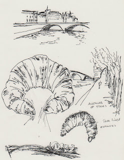
A few sketches, I wondered about using a croissant as the arch shape of the legs of the tower.

The following image was created gradually as reference material was found

I believe the core of the idea has the essence of the illustration I had in mind, there are elements that are strong which I will keep but parts need a bit of refinement or a better reference image.

As far as the media and medium to use I haven't given it much thought. I thought that I might use software to add colour once a line drawing had been completed

In the meantime searching for other visual possibilities...

I saw the front cover of the Saturday Telegraph Review supplement a photograph of an astronaut space walking it's a relatively short step to space walking waiter... but rejecting this placed the Eiffel tower strategically..probably no further action required!

A couple of extra sketches follow...

Experimenting with ideas for colouring prior to completing my line drawing, I chose a random approach over a copy of my previous tower combination

Although messy it does have some merit, a plain line drawing with splashes of colour to indicate the vibrancy of the city.

I saw this advert for a sofa sale and the effect of the splashed colour would suit the type of effect I am after, If I can replicate it

Now for the creation of the line drawing.. I re sketched the images that will be in the final combination and created individual line versions by tracing the out line.

I have little idea how to create the colour effect I have in mind, time for an experiment

OK;... not quite what I had in mind.. I'll take a look at the Procreate app

I have scanned in the individual outline drawings and arranged them.

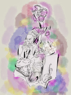
Unfortunately I had already started to add colour before I thought to record this step. There are some effects built in to the app, so I tried a few out before before plumping for a water brush painting style

first off the overall effect looked flat, I felt this was because there was no depth in the line drawing element. So I added some additional dark lines to reinforce some lines

This represents my final image. I think my ideal illustration would have captured not just the literal words and phrases but the 'picture' and emotion conjured up by them. Do I feel that I have succeeded?

Well, not entirely. Its a good idea not very well executed. Its one thing to have competent ideas but when juggling with a lack of technique against avoiding repeating the same techniques and thereby not learning is very frustrating and can ultimately dictate the end piece adversely.