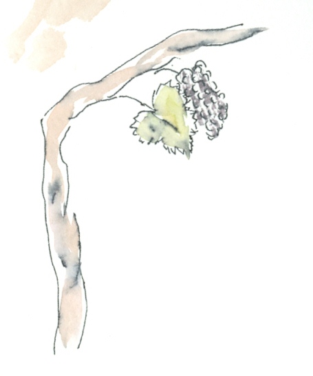
Prolific designer, illustrator, print maker, and war artist. Mainly because of the impact, on me, of his linocut and lithographic prints; particularly an excellent set of designs depicting 6 London Markets and Liverpool Street station. Which were amongst the first of his designs that I came across. However they were commissioned in the late 50s and are not typical of his early commercial work. He worked for agencies at the height of the depression that effected Britain between the wars. But the effects of this, in the Southeast and London, where Edward was based, were less severe.
Due to the new light industries and services there was a sizeable population with expendable income which initiated a consumer boom. The time was right for a new style and Edward would find plenty of work. Amongst the big name companies Edward created designs for were Fortnum and Masons , Shell, Penguin Books and Imperial Air. He also created many cookery and recipe book covers particularly for Ambrose Heath. As well as designs for wall paper; beer bottle labels, posters, famously for Kew Gardens. He also worked with ceramics and has designs created in ceramic tiles displayed on the walls of the platforms of Victoria, Tottenham Hale and Highbury & Islington tube stations.
His style has come to epitomise the period,and his early commercial art does seem dated now, compared to the slick graphics and imagery that we have become familiar with. They seem quite twee and have almost naive like, experimental quality to them. However they do display a deep understanding of the use of space, simplicity, communication and the importance of the connections between elements in good design. Some of his later illustrations have more of a retro feel so could be mistaken for contemporary.
I am looking forward to the reopening of the Cecil Higgins Gallery and Bedford Museum where they will have a gallery dedicated to EB.

For my contemporary illustrator I have chosen Richard Wilkinson again the descision was down to the instant visual appeal of some of his illustrations, during a general web search. There is not much biographical information about Richard apart from that he is based in London and started his career in the music industry. His style produces images that are soft often sombre yet capable of being potent when the subject requires it. His designs are commonly used to illustrate social or scientific commentary, often of a contencious nature. as far as technique goes,
Richard cleverly uses photoshop in an unusual way to ‘paint’ his images. Richard creates complex layers that mimic painting and although created electronically there is no short cut or compromise on the quality of the desired image.
Like Edward Bawden Richard illustrates, through an agency, for some companies with household names. The Daily Telegraph, Penguin Books, Honda Cars , New Scientist and Vodaphone.
In conclusion I feel that in certain respects Edward Bawden and his contemporaries were style and technique trail blazers, experimenting and honing their skills with little reference point in the design and style that went before. Whereas contemporary illustrators have the benefit of Edward's and his contemporaries legacy.
Idea for an illustration in the style of Edward Bawden I chose the subject of the Corporate drinks trolley this was a thought in part prompted by the cover of Good Drinks . But it was something I thought would potentially lend itself to the style and contain some humour.
I roughed a quick design idea and then compared the two.

If this simplistic method highlighted one thing it was that the EB designs are not just about angles and shade but imply, simply, depth and perspective. So I adapted my design to include these elements.

This would have been the basis for further refinement but is at present consigned to the work in progress file.
Weeks later and having now revisited the design. I set out to follow the last draft and produce a finished copy of it; but on reflection having looked again at several EB designs, I considered that there wasn't enough depth to the design. I did a bit of investigation into the design of a typical hostess trolley of the 30s and 40s. And an example being sold on a well known auction site caught my eye. The way that it had been photographed gave it a slightly distorted perspective which I felt would fit in with elements seen in the Edward Bawden examples I was following. Here is the result..

Originally the trolley and contents image was on its own however it looked 'lost' with to much space around it. Edward tended to fill the page pulling the elements together. There was nothing that appeared to 'tie' my trolley to the rest of the page. I added a 'mat' in such away as to fill out the space and to create a relationship with the title and the footnote.
The thought of copying the style of Richard Wilkinson was daunting. Although in essence the designs are simple the amount of work to achieve the look seemed almost prohibitive. So what has happened is that I got bogged down in the design process. I am after all a bit rusty having not picked up a brush or pen for some years.
Idea for Illustration in Richard Wilkinson Style.
Arsene Wenger, Arsenal Football Club’s most successful manager has not led his team to success in any competition in over 6 years.

My initial idea was to use the ‘lady of justice’

the statue above the Old Bailey essentially to have Arsene adopt the nothing to hide ‘open’ position and to carry the props.
The Sword indicating his principles and on the scales on one side a young player with potential counter balanced by money.
To progress I needed to sketch Arsenes face to a reasonable likeness to an almost caricature quality as RW style has an economy of feature almost cartoon like. Do some study of how suits sit in different poses. Study photos of Arsene in a pose near to the proposed if possible. Spend some time studying hands holding items.
The key hand positions following those on the statue, holding a sword up. I sketched my own holding a poker, not having a sword handy.

The next image is my rough of how the scales might look.

The scales could rest on the floor.

My next study was to be; how a suit 'sits' in different poses. Finding AW in the correct pose was proving difficult; but having sketched the suit from one photograph, I completely changed tack I had the idea of Arsene weighed down by balls and chains. A kind of “these are the chains I forged in.. my career…” - Jacob Marley-esk. Unfortunately I had a sense that I had spent so much time deliberating about the design that I have not as yet put together a finished illustration. Work in Progress again… After a brief pause I have put paint to paper and completed the illustration.