Probably a bit clichéd but I decided on incorporating each of the letters of ‘Hello’ into an image depicting an individual facet of my likes and interests with additional embellishments to add depth and movement. My design process was to be as follows:
- Outline of design
- Define elements
- Position elements
- Practice drawing unfamiliar images
- Decide on Media
My first consideration was how to handle the ‘e’. I came up with a solution by chance. I had already decided to include music but had no clear idea how to represent this. I played about with notation etc and the treble clef. I had abit of a eureka moment when I realised that with a slight modification to the standard shape I could incorporate the 'e' albeit backwards.
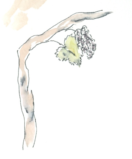
I had several ideas for ‘l’already.
An early outline roughed on any old scrap of paper.

This also includes secondary images I later dropped including family tree. For some inexplicable reason The second ‘l’ was becoming problematical. Starting life as a rake it then became a tree. But the significance of the tree didn’t seem obvious enough... and was a bit weak visually.

The Arsenal Football Club cannon emblem has now reserved its spot as ‘o’.
However a couple of dodgy looking cats there! They'll need some further study….now.. where are they?
There is a vacant space on the horizontal of the ‘H’. I feel this can easily accommodate an extra image; how about another cliché a squeezed paint tube. This 'tinkering' also prompts first thoughts on the media selection. There was a time when I only used pen and ink before experimenting with adding washes. So to incorporate this in the design by using a similar effect seemed apt.

As I don’t own an Indian ink pen at present; I used the pen that came with the course materials. Then added a water colour wash. Intentionally ‘dragging up’ some of the black of the pen. I liked the effect and decided I would use this for the finished design. Question; why do most of the preliminary attempts look better than the finished article?

I had previously roughed some sketches of birds in flight this one fits how I visualised the effect.
Cats… I spent some time sketching cat posture but on the internet found some cat silhouettes one of which looked exactly how one of my cats stands; so I have incorporated that and added her particular features as she is mostly white it is surprisingly effective. The second cat was originally intended to be on all fours but I changed my mind on the finished illustration.

Other thoughts on final composition; I had it in mind at the outset that I would include some extra images in the background other interests shown as silhouettes a sports car, church and a piece of hi fi equipment. On reflection decided that in the end they would add nothing to the design as it stood, which I was happy with, and most likely detract from it.
Only one thing left to do that is put it all together.I Have decided to create the illustration oversize so that I can reduce it to fit the card. My limited experience with quark express and layout suggests that this is the right way to handle this aspect of the project.

My plan to make the image oversize had one drawback I made it too large for my scanner; so to be able to play with sizing I had to scan in two sections and stitch them together in photoshop. Before creating the card size layout. I tried an A6 size but this was deemed to be too small for a card so I went for A5 folded size. One observation; reducing the image had more of an adverse effect on the wash effect of the images than I had thought. Maybe professional equipment would give more accurate results. Or you could compensate by putting in more colour than required to start with.
Instead of a greeting I outlined the items that could have been added to the design but were left out.
Its curious but It hadn’t occurred to me that the vine could be seen as a 'T' until I asked somebody to read what it said. Perhaps this is a question not focusing on the bigger picture. Mind you they also thought that the word began with C because of the cat!.
No comments:
Post a Comment