Having collected images for the excercise as described and created the scaled versions.
 |
| My selection of images. |
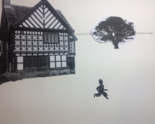
Altering the angle of the figure and placing a tree that is larger than the house above the house.This arrangement suggests the figure is running up a steep hill...
Playing with varying sizes of the elements illustrates the changing of the 'focal length' of the composition adding in horizontal lines adds to the impression.
With the background images angled away from the figure they act as a kind of brake on the perceived speed of the running figure..
Running but seeming to stand still? Over powered and hemmed in by the opposing angles of the tree and building..
i) When the figure is the smallest element it takes on more prominence, becomes the focus. There is a definite sense of vulnerability or insecurity and a greater depth of scale. There is a sense that the figure could be running around in circles.
ii) At differing angles to each other and to the frame. The placement I have chosen creates an arc over the figure that seems create focus and to hold the figure in place, reducing greatly the dynamic of movement in the figure.
iii) With all the elements all running vertical and horizontal to the frame it is is to make sense of the image, being a straight forward landscape with a figure running past a house and a tree any sense of movement or the dynamic is dictated mostly by the posture of the figure.This may increase or decrease with the size of the figure used.
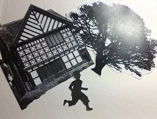
This is my favourite arrangement. Where the building is smaller than the tree and behind the figure it creates a sense of distance travelled. The angle of the tree and building accentuates the dynamic of rapid movement. The large figure implies a proximity to the background and the whole effect creates tension and drama.


No comments:
Post a Comment