Tuesday, June 25, 2013

Identifying tools and materials


I used the Association of illustrators web site to access a range of artists and their work from which to make my selection. It threw up one issue, although most illustrators describe the medium that they use, the method of use is not generally described. Particularly in respect of combinations of materials used in specific pieces.
 All that aside and contrary to my preference to avoid digital processes, the four illustrators I have chosen all use a digital process as some part of the final image. This was not a conscious decision on my part as I made the selection based on thumbnails of the illustrator's work.
However the combination of traditional  and digital methods is very appealing.

The four illustrators  I have chosen are:

Darren Hopes.
Darren mixes pencil and other medium, acrylic painting and photography to compose digital montage in Photoshop
He  varies the amount of each type of origination depending on subject.


Carly Allen-Fletcher.
Carly mixes physically drawn and painted pictures with digital colouring and graphic techniques. Contrasting clean edge
digital graphics against her own style of drawing and painting.


Lee Woodgate and Claire Nichols.
Both Lee and Claire create illustrations that have a printmaking quality to them, multi layered images
made up from simple photographic images and hand created textures and marks. Lee favours graphics and symbols in addition to monotone photographic images.
Lee's dramatic interplay of contrasting images and colour seem to contain a whole story in themself. Claire's less stark effects carry no less weight and encapsulate a deep sense of the subject. they both use graphics and symbolism to good effect.

This is my rendition of  my Brazzaville Beach book jacket from a previous exercise,  in the method of Lee Woodgate or Claire Nichols borrowing from both techniques ...hopefully.


Following the method of the artists I have chosen, I have taken a photograph on my iPad of the beach not 50 meters from the holiday let where I am am staying this week. I have manipulated the image and added text in an app called Aviary and used this as the first layer in my composition.
I did a quick sketch from a figure in a magazine and in Procreate adjusted its luminosity which changes its opacity also using the eraser tool on this layer renders the erased section transparent. I did like wise with the chimp image. There are some additional colouration layers added for effect. Not having access to Photoshop at present, the whole image has been put together in Procreate.

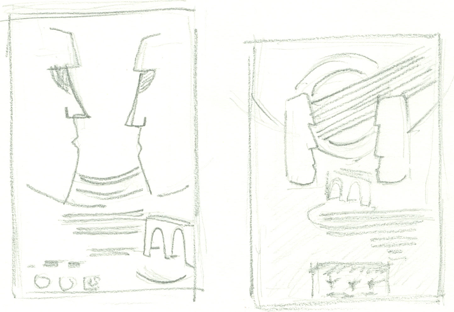
For my additional example of an illustration created by this method; I have taken as a brief to illustrate the town I am on holiday in. My initial idea as a thumbnail was fairly simple in design. And designed to incorporate photography and an element physically created, preferably pencil.


I had already started a sketch of part of the port architecture..


But dropped this idea in favour of a sketch of the local church.
Equipped with iPad I went into town to take some photographs of the church to sketch from and any other likely scenes where I thought there might be potential.
 
My sketch of the church
 
whilst drawing I considered its position in the design as a guide to how much of the scene I needed to complete.

A lot of the building is obscured by trees so I have included the main door to added scale whilst bearing in mind that aspects may be faded or covered by other elements.

By way of other content I had photographed a shuttered window, an image of the sea with some boats, the street sign of the Ruelle our rented property is in and a beach scene. I also intend to include a cycle in some form or other.

Next came a lot of experimentation with positioning, layers and effects. I also made a sketch of a cycle to include, having tried to use a digital paint version which didn't work out.


It was also a bit of a learning curve in the use of the two apps that I used to put it together. It is certainly not a case of slapping a few things on a screen and made me appreciate the vision and skill you have to have to produce a design that works.

Here is my finished design, luckily it only has to convey a sense of an understanding of the techniques involved.


My last additions modifications were to included a stone wall and I hand wrote the town name.
I had previously sketched the wall..

But for better overal balance elected to use a photograph instead.
 
Final thought
When I looked again at the professional artists work and compare to my effort, I could see a sense of hierarchy in their illustrations, which is something that in this particular exercise, I didn't really give any real consideration to; going for overall effect rather than stressing most to least important elements.


Wednesday, June 5, 2013

Assignment 3 - Poster

Talking Heads

For my poster project I have chosen to create a Poster for a concert by the band Talking Heads.This came from ideas at the 'brain storming - and pre brain storming mulling over' processes.  This  avant garde New Wave - american 4 piece band no longer exist but I was a fan in their heyday so why not?!

Brain storming threw up the following ideas

  • Talking Heads
  • Band Iconography
  • Easter Island - Standing heads
  • Minack theatre
  • Evening at the coast
  • Night of the iguana
  • Big lizards at the lizard
  • Stop Making Sense - 30 years 2014
  • Oversized suits
  • Head Sculptures
  • Burnt Orange
  • David Byrne + St. Vincent
  • Album cover designs
  • Swapping the top and bottom jaws on images.
The Moodboard
My feelings about the design of the poster so far are, I am keen to include the Easter Island heads in some way. The venue will be the Minack Theatre in Cornwall, I came across it relatively recently and thought that it would make an excellent venue for an intimate concert on a balmy summer evening. I will check out some Talking Heads iconography and album cover designs. I want to capture something of the feeling that the band projects.
During the general thought process I decide that I no longer want to resurrect the band. And
decide to invent a tribute band. Which will be called 'Not Making Sense'. This name derives from a video album that the band made called Stop Making Sense.

Some composition Ideas - Thumbnails


Experimenting with the use of the stone head images. Difficult to represent in a sketch, my idea is to deform the heads with a spiral effect and some kind of change to the colouration. This would reflect the idea of  'not making sense' as well as adding movement to the overall design.
Alternative design

This last thumbnail is my second favourite composition. 
A line drawing of my first choice is a little difficult to do as it involves twisting an image... I will most likely attempt this in photoshop, the extent of what I believe is called 'Twirl' will be a matter of what I feel achieves the best looking result.

I created this line drawing with the Procreate App on my ipad..
 
It's Ideal for creating this sort of instant visual.

I had intended to include a fine line drawing of the venue
 
But I went instead for a more subtle hexagonal pattern that replicates the pattern of slabs that form the stage.

The line drawing for my second design.


As I have decided to create the finished design in Photoshop it is a short step from mock-up to finished piece. I found a suitable hi resolution image of a view of some of the standing heads on Easter Island. I used a solarise filter and twirl. This image is to form the basis of the background of the poster.


A few words about the text and fonts. I feel that the design is about a correlation of the main image and text style(s). So the choice of font is important. I want to capture the essence of the original band the feel of their iconography at the same time complementing the background design.
Talking Heads commonly, although not exclusively, used a san serif  'blocky'  bold Arial / Helvetica type style.
For the band name, by trial and error,  I  settled for a font that I feel reflects the historical design concepts but also the avant garde, eclectic music style; Roller World BTN bold outline. The band usually turned the A's of their name on their heads so I have followed this ethos. I purposely set the leading so that the words slightly overlap. For the Venue I used a font that I had previously descounted for the band name, MV Boli which adds a lyrical musical feel just right for a concert. I have given it an outer glow this gives a feel of evening lighting.

 final design...


Saturday, June 1, 2013

Making a mock - up

Brazzaville Beach

I had a few ideas for a book, mostly novels I have recently read, but in the end chose at random from what we call our book room at home.The novel Brazzaville Beach by William Boyd. I have read it but that was when it was published in 1990. I cannot remember the plot so found a synopsis of the book on the internet.

 Briefly; it is a story set inThe Congo and seen through the eyes of a young woman who is working on a field study of chimpanzees.

Having originally been published some time ago there are now already several  versions of cover design. At this time none of the designs I have found feature images indicative of the story line that I have in mind.

Incorporating a beach scene as backdrop seems popular and I had not really any intention of straying from this brief. But I knew I wanted to feature a chimp in a pose, hopefully, reminiscent of a human posture. I picture it as Quite strong in the foreground, perhaps looking out to sea. I knew immediately when I saw the one that I have used, that it had the most potential. The contemplative nature of the pose was made for my design.


Technically speaking, I had decided to use Photoshop to create the mock up, but I needed to find out how to cut out the chimp from its background whilst keeping the hairiness of the coat. I found that my, albeit old, version has a feature called 'extract'. Which very cleverly creates a cut-out mask and can retain feathered edges. I found out how here
 http://www.makeuseof.com/tag/how-to-change-the-background-of-a-photo-in-photoshop/

I selected a few a tropical beach scenes, courtesy of internet image search. I opted for a fairly tranquil  scene with a palm tree to the right, (actually it was on the left so I flipped the image) I could equally have considered one where the sea had more waves for added drama.  I was prepared to lose a proportion of the tree if limitations on dimensions dictated. Which happened to be the case, but there is a nice shadow of the palms on the sand which stayed in view and gives some extra content and depth.

Not having a novel to hand at this precise moment; I looked up the common hardback book sizes. Octavo 9" X 6" seemed a good size to opt for but my finished size will be slightly narrower than this.
Having cut my chimp image from its background, I superimposed it on the beach scene. The visual was near to my ideal design.
I then thought about font; thinking about authenticity I did some research into the kinds of type face that may be found or used in the Congo where the book is set. I had limited success, but it left me with at least an idea of a 'feel' for a type that might be used. I chose 'Undercurrent' (plenty of them in the book).
I was curious to find out if a chimp's sight was like ours, as filtering the beach scene to reflect this was an idea, apparently they see the world more or less as we do.
I had a bit of a problem with finding out who publishes it now and having opted on Vintage Publishers and acquired the Logo, I discovered a copy published by Penguin can also be bought.
Having positioned the elements I did a test print to PDF forgetting that the overall size had not been adjusted from the original beach image. The resulting clipped print made the chimps head more prominent which is something I had not considered, food for thought.
Having tweaked the positioning of my text and played with the colour, brightness and contrast levels of the background, the original, I found, was too vivid.
This is my final effort for the mock up.