For my poster project I have chosen to create a Poster for a concert by the band Talking Heads.This came from ideas at the 'brain storming - and pre brain storming mulling over' processes. This avant garde New Wave - american 4 piece band no longer exist but I was a fan in their heyday so why not?!
Brain storming threw up the following ideas
- Talking Heads
- Band Iconography
- Easter Island - Standing heads
- Minack theatre
- Evening at the coast
- Night of the iguana
- Big lizards at the lizard
- Stop Making Sense - 30 years 2014
- Oversized suits
- Head Sculptures
- Burnt Orange
- David Byrne + St. Vincent
- Album cover designs
- Swapping the top and bottom jaws on images.
 |
| The Moodboard |
My feelings about the design of the poster so far are, I am keen to include the Easter Island heads in some way. The venue will be the Minack Theatre in Cornwall, I came across it relatively recently and thought that it would make an excellent venue for an intimate concert on a balmy summer evening. I will check out some Talking Heads iconography and album cover designs. I want to capture something of the feeling that the band projects.
During the general thought process I decide that I no longer want to resurrect the band. And
decide to invent a tribute band. Which will be called 'Not Making Sense'. This name derives from a video album that the band made called Stop Making Sense.
Some composition Ideas - Thumbnails

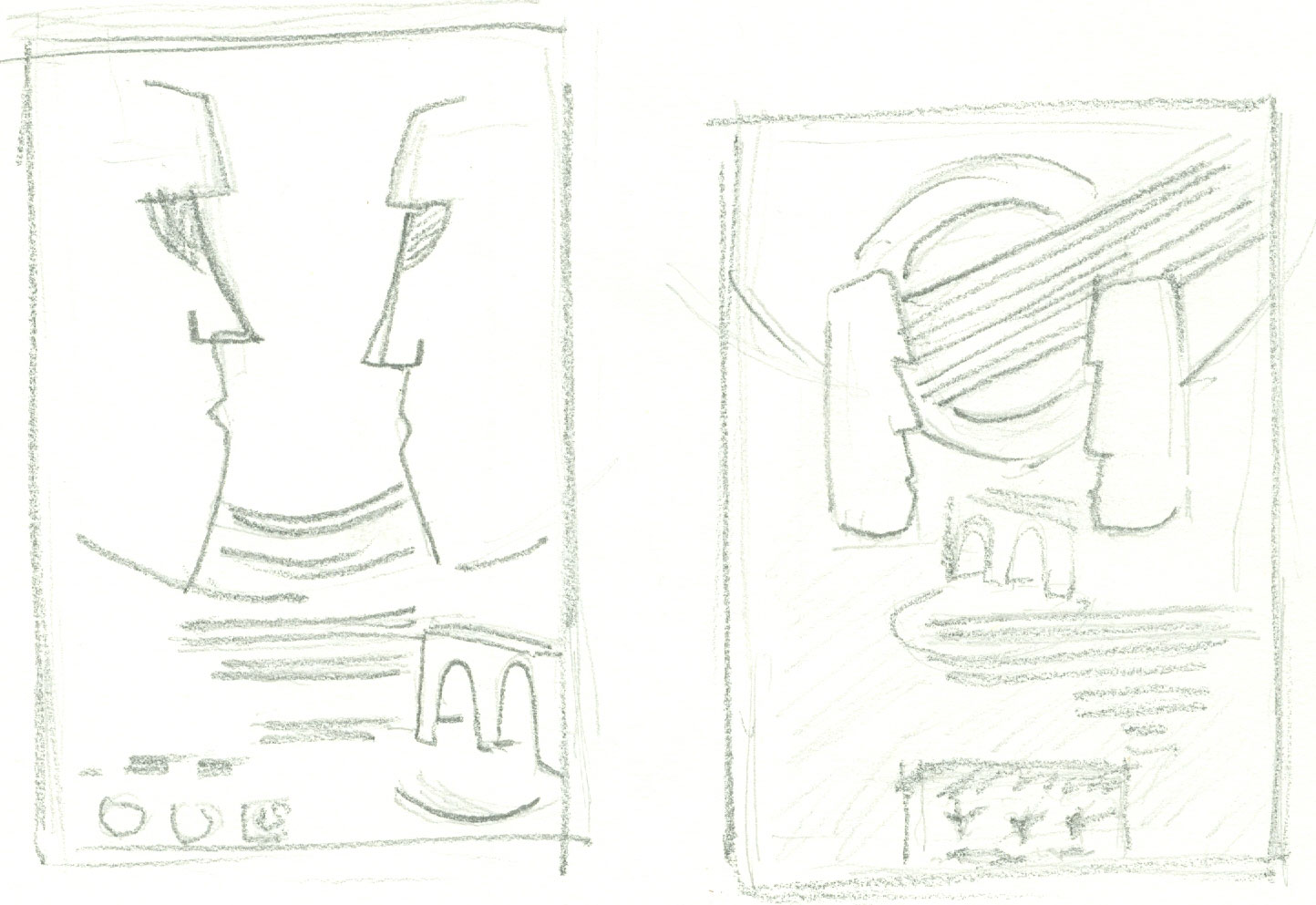
Experimenting with the use of the stone head images. Difficult to represent in a sketch, my idea is to deform the heads with a spiral effect and some kind of change to the colouration. This would reflect the idea of 'not making sense' as well as adding movement to the overall design.

Alternative design

This last thumbnail is my second favourite composition.
A line drawing of my first choice is a little difficult to do as it involves twisting an image... I will most likely attempt this in photoshop, the extent of what I believe is called 'Twirl' will be a matter of what I feel achieves the best looking result.
I created this line drawing with the Procreate App on my ipad..

It's Ideal for creating this sort of instant visual.
I had intended to include a fine line drawing of the venue

But I went instead for a more subtle hexagonal pattern that replicates the pattern of slabs that form the stage.
The line drawing for my second design.

As I have decided to create the finished design in Photoshop it is a short step from mock-up to finished piece. I found a suitable hi resolution image of a view of some of the standing heads on Easter Island. I used a solarise filter and twirl. This image is to form the basis of the background of the poster.

A few words about the text and fonts. I feel that the design is about a correlation of the main image and text style(s). So the choice of font is important. I want to capture the essence of the original band the feel of their iconography at the same time complementing the background design.
Talking Heads commonly, although not exclusively, used a san serif 'blocky' bold Arial / Helvetica type style.
For the band name, by trial and error, I settled for a font that I feel reflects the historical design concepts but also the avant garde, eclectic music style; Roller World BTN bold outline. The band usually turned the A's of their name on their heads so I have followed this ethos. I purposely set the leading so that the words slightly overlap. For the Venue I used a font that I had previously descounted for the band name, MV Boli which adds a lyrical musical feel just right for a concert. I have given it an outer glow this gives a feel of evening lighting.
final design...
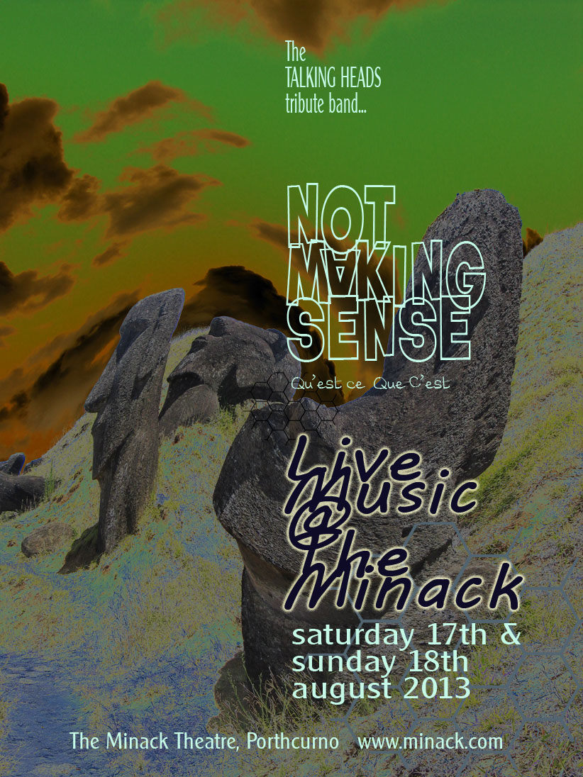
Full size PDF is here www.chezsud.co.uk/OCADOC/OCA_assign3_poster.pdf
No comments:
Post a Comment