7 Days in Havana
Googling the term '7 days' produced a reference to the film 7 Days in HavanaIntended to be 7 stories with a cultural reference point. On reading a brief synopsis and given the fact that each day is in itself a short film by a different director; I am quite keen to give this subject some consideration with a view to making this film the basis of the final assignment.
Firstly; get hold of the DVD
First off I sat down and watched the film with a sketch pad and pencil. I noted key words, themes and anything that I thought worth noting. I expected that during the exercise I would be reviewing the film regularly; So I didn't have to be too concise straight off
I guess it was akin to brain storming
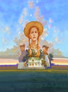
There are a collection of posters one for each film within the film, three of which are shown below. I think they are excellent designs but to my mind don't express the nature of the film. Except maybe for Ritual. I intend to attempt to capture the atmosphere and illustrate the title of each piece.
I have decided that I am going to illustrate in a pop art strip style and see it as an alternative marketing strategy. In the form of an A3 poster.
More watching and sketching; in certain respects it felt quite aimless at times, but doing something whilst watching and thinking about the story lines, characters and certain scenes could only be to the good.
By this point I had stopped jotting down key words. I felt that as I got into each piece I didn't need to rely on any other stimulus, I could just review scenes to evolve ideas. I wanted to avoid just ending up with illustrations that were in effect stills of the film but I saw no problem with combining characters and scenes in a condensed way.
I started sketching some thumbnails
Exploring possibilities...
I wish I could say that I methodically went through each day in an orderly fashion, however this is not the case as I flitted backwards and forwards through the film sequences.
I have found a way to capture and save screen shots when viewing the DVD through my notebook. This is going to speed up the process as I can scan the film and grab reference material at will.
Some of these sketches are oversize thumbnails to test framing some are attempts at catching a particular expression or view.
I have now accumulated my collection of designs and the plan is to make an outline drawing of each on tracing paper then scan to import into the Procreate app to add colour. This will be the basis of my client visuals
As I haven't previously given any sense of sequence perhaps this is an opportunity
Monday - El Yuma
After several attempts at sketching this face and not capturing, I felt, the character I printed off a frame capture and traced a line drawing
Tuesday - Jam session
Wednesday - The temptation of Cecilia
Thursday -Diary of a Beginner
Friday - Ritual
Saturday - Bitter Sweet
Sunday - The Fountain
Given some treatment in Procreate my client visuals..
At this point I had fully intended to render the designs again in the final medium of choice, probably water colour, but having yet again found myself with very little time left before the deadline, decided to rework the client visual files and prepare the final design in Procreate.
This plan worked up to a point. I was able to paste the panels to form something of a design but had to split the 7 into two. procreate is not really a paste up tool. I wanted to indicate the relevant day within each illustration, the only way I think I could achieve this is to put it into Photoshop; I can also amalgamate the 7 into one design of the required size. This was the first time that I had thought about the positioning of each panel, except to say that, originally I had had it in mind it would be one long strip.
I guess that this could have been something that I could have worked out on paper before hand.
.JPG)
Having come to a decision of final placing I could see that aside from my images there seemed too much dead white space. I recalled a picture of some of the grand architecture in Havana, similar to that used on the DVD cover. I used an effect filter to lose some of the detail and change it to a halftone then used the photocopy filter in PS and reduced the opacity, to create a backdrop.
On the whole I am pleased with the results. If not slightly disappointed that I couldn't recreate the dotted shade tone, common in the Pop art style. If I had any criticism of myself I feel there are several key areas where a little more application and less thinking time wouldn't go amiss. Again as throughout the course I feel I have struggled against a lack of technical ability or experience with certain media; this leads to reduced scope when considering design, execution and finish. even in this last assignment there was an amount of experimentation going on even up to the final design.
I certainly feel that some painting and or mixed media tuition, experimentation, would be beneficial if I were to think about progressing with illustration in the future.
Here are are links to the albums of images used for reference:
Monday
Tuesday
Wednesday
Thursday
Friday
Saturday
Sunday


.JPG)


.JPG)


.JPG)


