To stimulate the thought process when considering a topic for illustration it is key to explore as many possiblities
as is practicle. An aid to starting this process is the Spider diagram. Taking the subject name i.e. 'fashion' as the centre point write down words that come to mind then do the same again from those words untill you end up with something like...
To move on from this you then think about the words that you have compiled, whilst considering new and alternative words, and 'convert' them into images.
My initial attempt was very much just, think of a word or pick a word on the spider chart and sketch an image quickly without considering detail or technique
I then decided to tear some thick water colour paper in to squares and create one or two images on each. This time in more detail. I used pencil, ink, ink pen and water colour. Here are some examples..
Having worked through these processes I can use a combination of the thoughts stimulated by the words from the spider diagram and the pictorial versions to put together a moodboard. Essentially a further visual reference point, a representation of ideas on illustrating the topic. Although the aim of the Moodboard is not to produce a finished piece of art; I found it difficult to resist the temptation to create a design whilst deciding how to use the images I had found. Perhaps I didn't resist at all, scalpel art!
Wednesday, May 23, 2012
Sunday, April 29, 2012
Exercise 2 - Editorial interpretation
Taken from the January issue of Hi Fi news, the editor asks the question; how relevant will the content of the current issue of the magazine be in 50 years time. In answer to his own question he points out that the Vinyl LP is now over 50 years old and is enjoying something of a resurgence in popularity.
Attention is also focused on the CD. Launched 30 years ago the magazine will be helping celebrate its pearl anniversary.
His second point is regarding hearing. It’s a vital part in the music reproduction chain; but how many people take as much care with their hearing as they do with their sound reproduction equipment. Is it the elephant in the hi fi listening room?.
My interpretation is that ‘good’ technology, particularly in music reproduction, lasts longer than expectations and that new emerging technologies don't necessarily dictate the fate of the older technology.
Ideas to interpret this editorial through illustration included incorporating symbols and or images of the past, present and future sound playback technologies living side by side. I researched symbols used in laser technology and from hifi equipment manuals and circuit diagrams.
Initial rough
I felt that key to the design would be a suitably futuristic 'listener' and in browsing
the internet for a likely subject, I happened upon manniquin heads used for displaying wigs. One in particular caught my eye; it had all the attributes I was looking for, a futuristic visage, slightly android, androgynous appearance. Unusually small ears which had the potential to show the evolution of the ear that may happen when all sound is compressed e.g. mp3 etc
The next step was to sketch ideas as they came to me combined with some of the symbols I had already found.. ending up with an ideas mash up! emphasising some of the key words and thoughts from the editorial.
I then went through a kind of selective thought process, mentally rating the sketch ideas and discounting the elements that I thought weak or not easily identifiable. After this process I had in mind to keep to three main images. I liked the idea of the use of the head to create 'the listener' and an image of a CD as my 'old technology'. But I needed some way of illustrating that the listener was involved in the process of listening to digital compressed sound, the sound of the present possibly future technology, possibly using binary code...I sketched some ideas.
Sticking with the concept of binary code entering one ear and leaving the other I made the first draft of the layout.
Happy with the design so far. I was unsure of what media to use. I felt the right finish would heighten the impact of the simple design. Although unfamiliar with the use of pastels I experimented a bit. I will admit that experimentation was limited and I had at one point settled for this version.
I really had in mind that the binary code would be quite subtle but could see that it would, potentially, take a lot of experimentation to achive the desired effect. And at that point I left the exercise to carry on with the first assignment.
Endeavouring to get this record on the blog I re-appraised the design and looked at constructing the design in Photoshop. I have some experience with the software but am unfamiliar with a lot of the tools. I did a bit of experimentaion.
I am quite pleased with the attempt. It obviously requires more work. I would like to 'paint in' the body and possibly reintroduce the binary code effect but this would require further practical instruction in Photoshop.
Attention is also focused on the CD. Launched 30 years ago the magazine will be helping celebrate its pearl anniversary.
His second point is regarding hearing. It’s a vital part in the music reproduction chain; but how many people take as much care with their hearing as they do with their sound reproduction equipment. Is it the elephant in the hi fi listening room?.
My interpretation is that ‘good’ technology, particularly in music reproduction, lasts longer than expectations and that new emerging technologies don't necessarily dictate the fate of the older technology.
Ideas to interpret this editorial through illustration included incorporating symbols and or images of the past, present and future sound playback technologies living side by side. I researched symbols used in laser technology and from hifi equipment manuals and circuit diagrams.
Initial rough
I felt that key to the design would be a suitably futuristic 'listener' and in browsing
the internet for a likely subject, I happened upon manniquin heads used for displaying wigs. One in particular caught my eye; it had all the attributes I was looking for, a futuristic visage, slightly android, androgynous appearance. Unusually small ears which had the potential to show the evolution of the ear that may happen when all sound is compressed e.g. mp3 etc
The next step was to sketch ideas as they came to me combined with some of the symbols I had already found.. ending up with an ideas mash up! emphasising some of the key words and thoughts from the editorial.
I then went through a kind of selective thought process, mentally rating the sketch ideas and discounting the elements that I thought weak or not easily identifiable. After this process I had in mind to keep to three main images. I liked the idea of the use of the head to create 'the listener' and an image of a CD as my 'old technology'. But I needed some way of illustrating that the listener was involved in the process of listening to digital compressed sound, the sound of the present possibly future technology, possibly using binary code...I sketched some ideas.
Sticking with the concept of binary code entering one ear and leaving the other I made the first draft of the layout.
Happy with the design so far. I was unsure of what media to use. I felt the right finish would heighten the impact of the simple design. Although unfamiliar with the use of pastels I experimented a bit. I will admit that experimentation was limited and I had at one point settled for this version.
I really had in mind that the binary code would be quite subtle but could see that it would, potentially, take a lot of experimentation to achive the desired effect. And at that point I left the exercise to carry on with the first assignment.
Endeavouring to get this record on the blog I re-appraised the design and looked at constructing the design in Photoshop. I have some experience with the software but am unfamiliar with a lot of the tools. I did a bit of experimentaion.
I am quite pleased with the attempt. It obviously requires more work. I would like to 'paint in' the body and possibly reintroduce the binary code effect but this would require further practical instruction in Photoshop.
Tuesday, March 27, 2012
Exercise - History of Illustration
Edward Bawden; CBE RA
After researching each of the listed illustrators I was drawn to Edward Bawden.
Prolific designer, illustrator, print maker, and war artist. Mainly because of the impact, on me, of his linocut and lithographic prints; particularly an excellent set of designs depicting 6 London Markets and Liverpool Street station. Which were amongst the first of his designs that I came across. However they were commissioned in the late 50s and are not typical of his early commercial work. He worked for agencies at the height of the depression that effected Britain between the wars. But the effects of this, in the Southeast and London, where Edward was based, were less severe.
Due to the new light industries and services there was a sizeable population with expendable income which initiated a consumer boom. The time was right for a new style and Edward would find plenty of work. Amongst the big name companies Edward created designs for were Fortnum and Masons , Shell, Penguin Books and Imperial Air. He also created many cookery and recipe book covers particularly for Ambrose Heath. As well as designs for wall paper; beer bottle labels, posters, famously for Kew Gardens. He also worked with ceramics and has designs created in ceramic tiles displayed on the walls of the platforms of Victoria, Tottenham Hale and Highbury & Islington tube stations.
His style has come to epitomise the period,and his early commercial art does seem dated now, compared to the slick graphics and imagery that we have become familiar with. They seem quite twee and have almost naive like, experimental quality to them. However they do display a deep understanding of the use of space, simplicity, communication and the importance of the connections between elements in good design. Some of his later illustrations have more of a retro feel so could be mistaken for contemporary.
I am looking forward to the reopening of the Cecil Higgins Gallery and Bedford Museum where they will have a gallery dedicated to EB.
For my contemporary illustrator I have chosen Richard Wilkinson again the descision was down to the instant visual appeal of some of his illustrations, during a general web search. There is not much biographical information about Richard apart from that he is based in London and started his career in the music industry. His style produces images that are soft often sombre yet capable of being potent when the subject requires it. His designs are commonly used to illustrate social or scientific commentary, often of a contencious nature. as far as technique goes,
Richard cleverly uses photoshop in an unusual way to ‘paint’ his images. Richard creates complex layers that mimic painting and although created electronically there is no short cut or compromise on the quality of the desired image.
I put the two side by side.
If this simplistic method highlighted one thing it was that the EB designs are not just about angles and shade but imply, simply, depth and perspective. So I adapted my design to include these elements.
This would have been the basis for further refinement but is at present consigned to the work in progress file.
Weeks later and having now revisited the design. I set out to follow the last draft and produce a finished copy of it; but on reflection having looked again at several EB designs, I considered that there wasn't enough depth to the design. I did a bit of investigation into the design of a typical hostess trolley of the 30s and 40s. And an example being sold on a well known auction site caught my eye. The way that it had been photographed gave it a slightly distorted perspective which I felt would fit in with elements seen in the Edward Bawden examples I was following. Here is the result..
Originally the trolley and contents image was on its own however it looked 'lost' with to much space around it. Edward tended to fill the page pulling the elements together. There was nothing that appeared to 'tie' my trolley to the rest of the page. I added a 'mat' in such away as to fill out the space and to create a relationship with the title and the footnote.
The thought of copying the style of Richard Wilkinson was daunting. Although in essence the designs are simple the amount of work to achieve the look seemed almost prohibitive. So what has happened is that I got bogged down in the design process. I am after all a bit rusty having not picked up a brush or pen for some years.
Idea for Illustration in Richard Wilkinson Style.
Arsene Wenger, Arsenal Football Club’s most successful manager has not led his team to success in any competition in over 6 years.
He has a principled vision of how football should be played and a team built and managed. He favours buying players with potential and creating top footballers against paying premium prices for the finished article. Does his recent lack of success point to a flaw in his vision or has he become a victim of his principles in respect of his unwillingness to bend under the criticism of fans and football commentators.
My initial idea was to use the ‘lady of justice’
the statue above the Old Bailey essentially to have Arsene adopt the nothing to hide ‘open’ position and to carry the props.
The Sword indicating his principles and on the scales on one side a young player with potential counter balanced by money.
To progress I needed to sketch Arsenes face to a reasonable likeness to an almost caricature quality as RW style has an economy of feature almost cartoon like. Do some study of how suits sit in different poses. Study photos of Arsene in a pose near to the proposed if possible. Spend some time studying hands holding items.
The key hand positions following those on the statue, holding a sword up. I sketched my own holding a poker, not having a sword handy.
The next image is my rough of how the scales might look.
By this time trying to second guess how RW would handle the pose I was changing my mind about basing it on the statues pose and had decided to go for a less strident posture but keep the props. There is an illustration by RW of a monkey in a suit surrounded by bananas I may investigate that 'look'. excluding the bananas!
The scales could rest on the floor.
My next study was to be; how a suit 'sits' in different poses. Finding AW in the correct pose was proving difficult; but having sketched the suit from one photograph, I completely changed tack I had the idea of Arsene weighed down by balls and chains. A kind of “these are the chains I forged in.. my career…” - Jacob Marley-esk. Unfortunately I had a sense that I had spent so much time deliberating about the design that I have not as yet put together a finished illustration. Work in Progress again… After a brief pause I have put paint to paper and completed the illustration. On the whole I am happy with the consept and arrangement. Some of the techniques I have used need some more practice. I feel I have the essence of the style of a Richard Wilkinson design if not the content I am consious that its abit cliched.
After researching each of the listed illustrators I was drawn to Edward Bawden.
Prolific designer, illustrator, print maker, and war artist. Mainly because of the impact, on me, of his linocut and lithographic prints; particularly an excellent set of designs depicting 6 London Markets and Liverpool Street station. Which were amongst the first of his designs that I came across. However they were commissioned in the late 50s and are not typical of his early commercial work. He worked for agencies at the height of the depression that effected Britain between the wars. But the effects of this, in the Southeast and London, where Edward was based, were less severe.
Due to the new light industries and services there was a sizeable population with expendable income which initiated a consumer boom. The time was right for a new style and Edward would find plenty of work. Amongst the big name companies Edward created designs for were Fortnum and Masons , Shell, Penguin Books and Imperial Air. He also created many cookery and recipe book covers particularly for Ambrose Heath. As well as designs for wall paper; beer bottle labels, posters, famously for Kew Gardens. He also worked with ceramics and has designs created in ceramic tiles displayed on the walls of the platforms of Victoria, Tottenham Hale and Highbury & Islington tube stations.
His style has come to epitomise the period,and his early commercial art does seem dated now, compared to the slick graphics and imagery that we have become familiar with. They seem quite twee and have almost naive like, experimental quality to them. However they do display a deep understanding of the use of space, simplicity, communication and the importance of the connections between elements in good design. Some of his later illustrations have more of a retro feel so could be mistaken for contemporary.
I am looking forward to the reopening of the Cecil Higgins Gallery and Bedford Museum where they will have a gallery dedicated to EB.
For my contemporary illustrator I have chosen Richard Wilkinson again the descision was down to the instant visual appeal of some of his illustrations, during a general web search. There is not much biographical information about Richard apart from that he is based in London and started his career in the music industry. His style produces images that are soft often sombre yet capable of being potent when the subject requires it. His designs are commonly used to illustrate social or scientific commentary, often of a contencious nature. as far as technique goes,
Richard cleverly uses photoshop in an unusual way to ‘paint’ his images. Richard creates complex layers that mimic painting and although created electronically there is no short cut or compromise on the quality of the desired image.
Like Edward Bawden Richard illustrates, through an agency, for some companies with household names. The Daily Telegraph, Penguin Books, Honda Cars , New Scientist and Vodaphone.
In conclusion I feel that in certain respects Edward Bawden and his contemporaries were style and technique trail blazers, experimenting and honing their skills with little reference point in the design and style that went before. Whereas contemporary illustrators have the benefit of Edward's and his contemporaries legacy.
Idea for an illustration in the style of Edward Bawden I chose the subject of the Corporate drinks trolley this was a thought in part prompted by the cover of Good Drinks . But it was something I thought would potentially lend itself to the style and contain some humour.
I roughed a quick design idea and then compared the two.
If this simplistic method highlighted one thing it was that the EB designs are not just about angles and shade but imply, simply, depth and perspective. So I adapted my design to include these elements.
This would have been the basis for further refinement but is at present consigned to the work in progress file.
Weeks later and having now revisited the design. I set out to follow the last draft and produce a finished copy of it; but on reflection having looked again at several EB designs, I considered that there wasn't enough depth to the design. I did a bit of investigation into the design of a typical hostess trolley of the 30s and 40s. And an example being sold on a well known auction site caught my eye. The way that it had been photographed gave it a slightly distorted perspective which I felt would fit in with elements seen in the Edward Bawden examples I was following. Here is the result..
Originally the trolley and contents image was on its own however it looked 'lost' with to much space around it. Edward tended to fill the page pulling the elements together. There was nothing that appeared to 'tie' my trolley to the rest of the page. I added a 'mat' in such away as to fill out the space and to create a relationship with the title and the footnote.
The thought of copying the style of Richard Wilkinson was daunting. Although in essence the designs are simple the amount of work to achieve the look seemed almost prohibitive. So what has happened is that I got bogged down in the design process. I am after all a bit rusty having not picked up a brush or pen for some years.
Idea for Illustration in Richard Wilkinson Style.
Arsene Wenger, Arsenal Football Club’s most successful manager has not led his team to success in any competition in over 6 years.
He has a principled vision of how football should be played and a team built and managed. He favours buying players with potential and creating top footballers against paying premium prices for the finished article. Does his recent lack of success point to a flaw in his vision or has he become a victim of his principles in respect of his unwillingness to bend under the criticism of fans and football commentators.
My initial idea was to use the ‘lady of justice’

the statue above the Old Bailey essentially to have Arsene adopt the nothing to hide ‘open’ position and to carry the props.
The Sword indicating his principles and on the scales on one side a young player with potential counter balanced by money.
To progress I needed to sketch Arsenes face to a reasonable likeness to an almost caricature quality as RW style has an economy of feature almost cartoon like. Do some study of how suits sit in different poses. Study photos of Arsene in a pose near to the proposed if possible. Spend some time studying hands holding items.
The key hand positions following those on the statue, holding a sword up. I sketched my own holding a poker, not having a sword handy.
The next image is my rough of how the scales might look.
By this time trying to second guess how RW would handle the pose I was changing my mind about basing it on the statues pose and had decided to go for a less strident posture but keep the props. There is an illustration by RW of a monkey in a suit surrounded by bananas I may investigate that 'look'. excluding the bananas!
The scales could rest on the floor.
My next study was to be; how a suit 'sits' in different poses. Finding AW in the correct pose was proving difficult; but having sketched the suit from one photograph, I completely changed tack I had the idea of Arsene weighed down by balls and chains. A kind of “these are the chains I forged in.. my career…” - Jacob Marley-esk. Unfortunately I had a sense that I had spent so much time deliberating about the design that I have not as yet put together a finished illustration. Work in Progress again… After a brief pause I have put paint to paper and completed the illustration. On the whole I am happy with the consept and arrangement. Some of the techniques I have used need some more practice. I feel I have the essence of the style of a Richard Wilkinson design if not the content I am consious that its abit cliched.
Sunday, March 25, 2012
Assignment 1 - Say Hello
Design consideration; Incorporate images showing hobbies and subjects I find of interest or that say something about me, into a design suitable for a greetings card.
Probably a bit clichéd but I decided on incorporating each of the letters of ‘Hello’ into an image depicting an individual facet of my likes and interests with additional embellishments to add depth and movement. My design process was to be as follows:
My first consideration was how to handle the ‘e’. I came up with a solution by chance. I had already decided to include music but had no clear idea how to represent this. I played about with notation etc and the treble clef. I had abit of a eureka moment when I realised that with a slight modification to the standard shape I could incorporate the 'e' albeit backwards.
I had several ideas for ‘l’already.
An early outline roughed on any old scrap of paper.
This also includes secondary images I later dropped including family tree. For some inexplicable reason The second ‘l’ was becoming problematical. Starting life as a rake it then became a tree. But the significance of the tree didn’t seem obvious enough... and was a bit weak visually.
The Arsenal Football Club cannon emblem has now reserved its spot as ‘o’.
However a couple of dodgy looking cats there! They'll need some further study….now.. where are they?
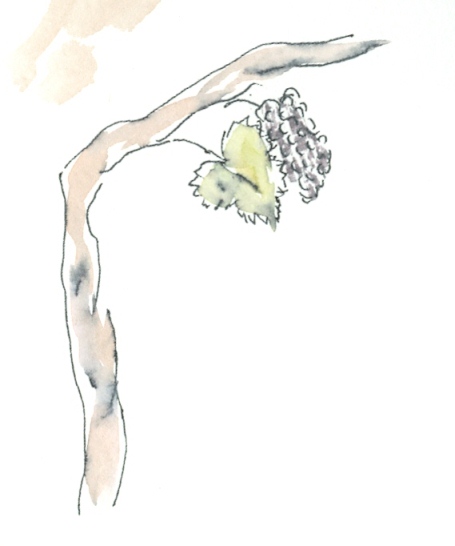
The tree is going!.Sorry Woodland Trust. On reflection my interest in wine, vinyards and wine regions sets this subject above most others. Fitting therefore that the second ‘l’ is to become a vine. I can then ‘tie’ some of the other elements together.
There is a vacant space on the horizontal of the ‘H’. I feel this can easily accommodate an extra image; how about another cliché a squeezed paint tube. This 'tinkering' also prompts first thoughts on the media selection. There was a time when I only used pen and ink before experimenting with adding washes. So to incorporate this in the design by using a similar effect seemed apt.
As I don’t own an Indian ink pen at present; I used the pen that came with the course materials. Then added a water colour wash. Intentionally ‘dragging up’ some of the black of the pen. I liked the effect and decided I would use this for the finished design. Question; why do most of the preliminary attempts look better than the finished article?
I had previously roughed some sketches of birds in flight this one fits how I visualised the effect.
Cats… I spent some time sketching cat posture but on the internet found some cat silhouettes one of which looked exactly how one of my cats stands; so I have incorporated that and added her particular features as she is mostly white it is surprisingly effective. The second cat was originally intended to be on all fours but I changed my mind on the finished illustration.
I regret this decision now as to me it breaks the triangle made with the bird and the other cat.
Other thoughts on final composition; I had it in mind at the outset that I would include some extra images in the background other interests shown as silhouettes a sports car, church and a piece of hi fi equipment. On reflection decided that in the end they would add nothing to the design as it stood, which I was happy with, and most likely detract from it.
Only one thing left to do that is put it all together.I Have decided to create the illustration oversize so that I can reduce it to fit the card. My limited experience with quark express and layout suggests that this is the right way to handle this aspect of the project.
My plan to make the image oversize had one drawback I made it too large for my scanner; so to be able to play with sizing I had to scan in two sections and stitch them together in photoshop. Before creating the card size layout. I tried an A6 size but this was deemed to be too small for a card so I went for A5 folded size. One observation; reducing the image had more of an adverse effect on the wash effect of the images than I had thought. Maybe professional equipment would give more accurate results. Or you could compensate by putting in more colour than required to start with.
Instead of a greeting I outlined the items that could have been added to the design but were left out.
Its curious but It hadn’t occurred to me that the vine could be seen as a 'T' until I asked somebody to read what it said. Perhaps this is a question not focusing on the bigger picture. Mind you they also thought that the word began with C because of the cat!.
Probably a bit clichéd but I decided on incorporating each of the letters of ‘Hello’ into an image depicting an individual facet of my likes and interests with additional embellishments to add depth and movement. My design process was to be as follows:
- Outline of design
- Define elements
- Position elements
- Practice drawing unfamiliar images
- Decide on Media
My first consideration was how to handle the ‘e’. I came up with a solution by chance. I had already decided to include music but had no clear idea how to represent this. I played about with notation etc and the treble clef. I had abit of a eureka moment when I realised that with a slight modification to the standard shape I could incorporate the 'e' albeit backwards.
I had several ideas for ‘l’already.
An early outline roughed on any old scrap of paper.
This also includes secondary images I later dropped including family tree. For some inexplicable reason The second ‘l’ was becoming problematical. Starting life as a rake it then became a tree. But the significance of the tree didn’t seem obvious enough... and was a bit weak visually.
The Arsenal Football Club cannon emblem has now reserved its spot as ‘o’.
However a couple of dodgy looking cats there! They'll need some further study….now.. where are they?
The tree is going!.Sorry Woodland Trust. On reflection my interest in wine, vinyards and wine regions sets this subject above most others. Fitting therefore that the second ‘l’ is to become a vine. I can then ‘tie’ some of the other elements together.
There is a vacant space on the horizontal of the ‘H’. I feel this can easily accommodate an extra image; how about another cliché a squeezed paint tube. This 'tinkering' also prompts first thoughts on the media selection. There was a time when I only used pen and ink before experimenting with adding washes. So to incorporate this in the design by using a similar effect seemed apt.
As I don’t own an Indian ink pen at present; I used the pen that came with the course materials. Then added a water colour wash. Intentionally ‘dragging up’ some of the black of the pen. I liked the effect and decided I would use this for the finished design. Question; why do most of the preliminary attempts look better than the finished article?
I had previously roughed some sketches of birds in flight this one fits how I visualised the effect.
Cats… I spent some time sketching cat posture but on the internet found some cat silhouettes one of which looked exactly how one of my cats stands; so I have incorporated that and added her particular features as she is mostly white it is surprisingly effective. The second cat was originally intended to be on all fours but I changed my mind on the finished illustration.
I regret this decision now as to me it breaks the triangle made with the bird and the other cat.
Other thoughts on final composition; I had it in mind at the outset that I would include some extra images in the background other interests shown as silhouettes a sports car, church and a piece of hi fi equipment. On reflection decided that in the end they would add nothing to the design as it stood, which I was happy with, and most likely detract from it.
Only one thing left to do that is put it all together.I Have decided to create the illustration oversize so that I can reduce it to fit the card. My limited experience with quark express and layout suggests that this is the right way to handle this aspect of the project.
My plan to make the image oversize had one drawback I made it too large for my scanner; so to be able to play with sizing I had to scan in two sections and stitch them together in photoshop. Before creating the card size layout. I tried an A6 size but this was deemed to be too small for a card so I went for A5 folded size. One observation; reducing the image had more of an adverse effect on the wash effect of the images than I had thought. Maybe professional equipment would give more accurate results. Or you could compensate by putting in more colour than required to start with.
Instead of a greeting I outlined the items that could have been added to the design but were left out.
Its curious but It hadn’t occurred to me that the vine could be seen as a 'T' until I asked somebody to read what it said. Perhaps this is a question not focusing on the bigger picture. Mind you they also thought that the word began with C because of the cat!.
Subscribe to:
Posts (Atom)